
Seaborn Heatmaps: A Complete Guide for Data Visualization
Seaborn heatmaps are a powerful and versatile tool for data visualization, especially for exploring and understanding complex data. In this article, you will learn everything you need to know about seaborn heatmaps, including how to create, customize, and use them with different datasets and parameters.
What are Seaborn Heatmaps and Why Use Them?
A heatmap is a data visualization technique that uses color-coding to represent different values of data. The data points are plotted onto a matrix, creating a grid of colored squares or rectangles. The color of each square corresponds to the value of the data point, with a color scale providing context for these values.
Heatmaps are particularly useful for visualizing large amounts of data and identifying trends, correlations, and patterns within the data. They are commonly used in various fields such as biology for gene expression analysis, marketing for website analytics, and more.
The primary advantage of using heatmaps is their ability to visually represent complex data in an intuitive manner. By using color gradients, heatmaps allow for immediate visual interpretation of data trends. This makes them an excellent tool for exploratory data analysis, where you’re trying to understand the data and uncover underlying structures.
Seaborn is a Python library that provides a high-level interface for creating attractive and informative statistical graphics. It is built on top of matplotlib, a low-level plotting library that offers more control over the details of the plots. Seaborn aims to make visualization a central part of exploring and understanding data, by providing a simple and elegant way to create various types of plots, including heatmaps.
How to Install Seaborn and Its Dependencies
Before you can start creating seaborn heatmaps, you need to install seaborn and its dependencies. Seaborn requires Python 3.6 or higher, and the following libraries:
- numpy: A library for scientific computing and array manipulation.
- scipy: A library for scientific and technical computing.
- pandas: A library for data analysis and manipulation.
- matplotlib: A library for low-level plotting and visualization.
- statsmodels: A library for statistical modeling and testing.
You can install seaborn and its dependencies using pip, a package manager for Python. To do so, open your terminal or command prompt and type the following command:
pip install seaborn
This will install seaborn and all the required libraries. Alternatively, you can use conda, another package manager for Python, especially if you are using Anaconda or Miniconda. To do so, type the following command:
conda install seaborn
This will also install seaborn and all the required libraries.
How to Import Seaborn and Other Libraries
Once you have installed seaborn and its dependencies, you need to import them in your Python script or notebook. You can use the following code to import seaborn and other libraries:
# Import seaborn and other libraries import seaborn as sns import matplotlib.pyplot as plt import numpy as np import pandas as pd |
You can also use aliases for the libraries, such as sns for seaborn and plt for matplotlib, to make your code more concise and readable.
How to Create a Basic Seaborn Heatmap
Creating a basic seaborn heatmap is very easy, thanks to the heatmap() function that takes care of most of the details for you. All you need to do is to pass a two-dimensional array of data to the function, and it will return a heatmap object that you can display with plt.show().
Let’s see an example of how to create a basic seaborn heatmap using a random dataset generated with NumPy:
# Create a random dataset data = np.random.rand(10, 12) # Create a seaborn heatmap sns.heatmap(data) # Display the seaborn heatmap plt.show() |
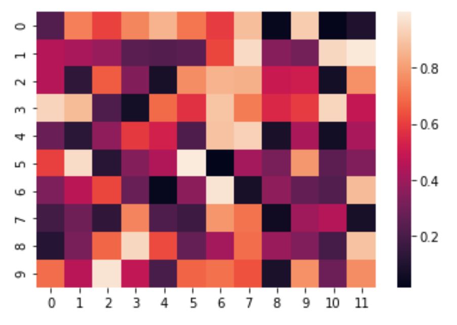
As you can see, the seaborn heatmap has a default color map that ranges from dark blue to light yellow, and a color bar that shows the values of the data points. The rows and columns of the heatmap are labeled with the indices of the data array.
How to Customize a Seaborn Heatmap
Seaborn provides a variety of options to customize the heatmap, such as changing the color map, adding annotations, adjusting the size, and more. You can pass these options as parameters to the heatmap() function, or use other seaborn or matplotlib functions to modify the heatmap object.
Let’s see some examples of how to customize a seaborn heatmap:
Changing the Color Map
The color map is one of the most important aspects of a heatmap, as it determines how the data values are represented by colors. Seaborn supports a wide range of color maps, which you can find in the documentation. You can pass the name of the color map as a string to the cmap parameter of the heatmap() function.
For example, let’s change the color map of our previous heatmap to viridis , which is a popular color map that uses a perceptually uniform color space:
# Create a seaborn heatmap with a different color map sns.heatmap(data, cmap='viridis') # Display the seaborn heatmap plt.show() |
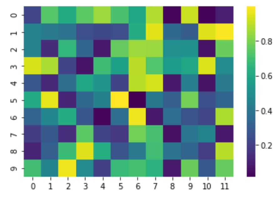
As you can see, the seaborn heatmap now has a different color scheme, ranging from dark purple to light yellow.
Adding a Color Bar
A color bar is a useful feature that shows the relationship between the colors and the data values. By default, seaborn adds a color bar to the heatmap, but you can disable it by setting the cbar parameter to False.
Alternatively, you can customize the color bar by passing a dictionary of options to the cbar_kws parameter of the heatmap() function. For example, you can change the size, orientation, label, and ticks of the color bar.
Let’s see an example of how to customize the color bar of our seaborn heatmap:
# Create a seaborn heatmap with a customized color bar sns.heatmap(data, cmap='viridis', cbar_kws={'shrink': 0.5, 'orientation': 'horizontal', 'label': 'Random Values', 'ticks': [0, 0.25, 0.5, 0.75, 1]}) # Display the seaborn heatmap plt.show() |
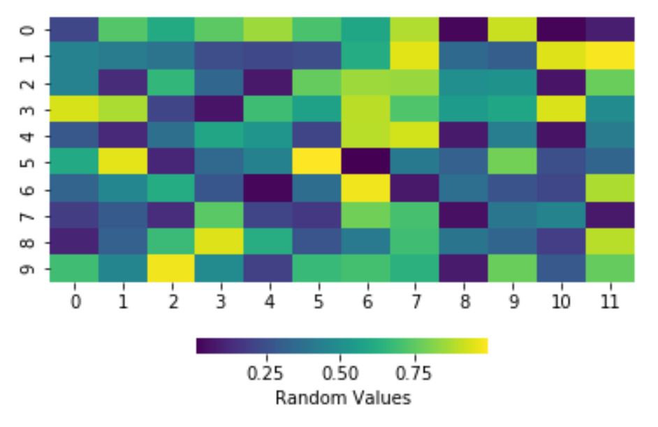
As you can see, the seaborn heatmap now has a horizontal color bar that is smaller, has a label, and has custom ticks.
Adding Annotations
Annotations are text labels that show the exact values of the data points on the heatmap. They can be useful for highlighting important information or adding context to the heatmap. You can enable annotations by setting the annot parameter to True , or pass a two-dimensional array of strings to the annot parameter to specify the text for each data point.
You can also customize the appearance of the annotations by passing a dictionary of options to the annot_kws parameter of the heatmap() function. For example, you can change the font size, color, and alignment of the annotations.
Let’s see an example of how to add annotations to our seaborn heatmap:
# Create a seaborn heatmap with annotations sns.heatmap(data, cmap='viridis', annot=True, annot_kws={'size': 10, 'color': 'white', 'ha': 'center', 'va': 'center'}) # Display the seaborn heatmap plt.show() |
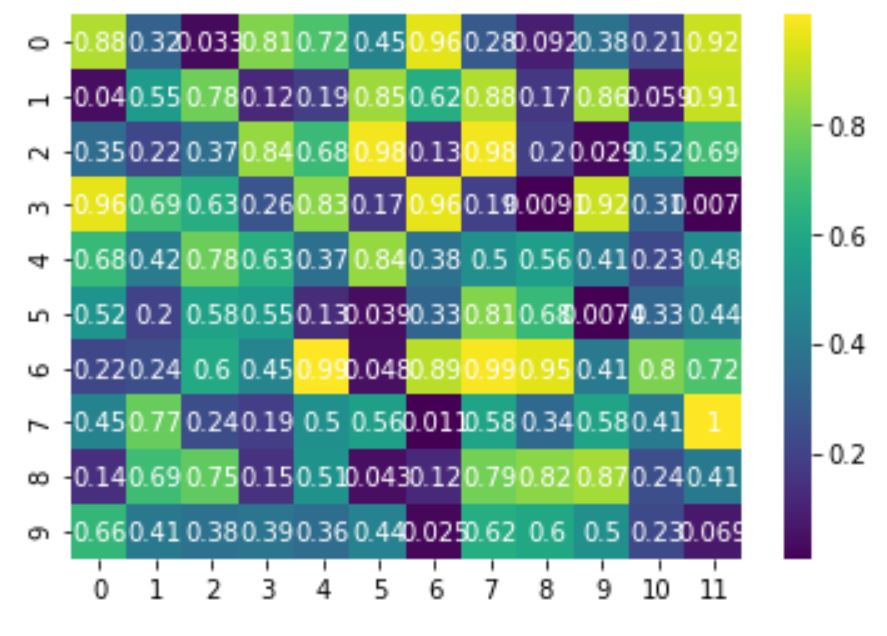
As you can see, the seaborn heatmap now has white text labels that show the values of the data points, with a custom font size and alignment.
How to Use Seaborn Heatmap with Real-world Data
So far, we have seen how to create and customize seaborn heatmaps using random data. But how can we use seaborn heatmaps with real-world data? The answer is simple: we just need to prepare the data in a suitable format for the heatmap() function.
The heatmap() function expects a two-dimensional array of data, where each row and column represents a variable, and each cell represents the value of the variable for a given observation. This format is also known as a tabular or rectangular format.
One way to create a tabular format from a real-world dataset is to use a correlation matrix. A correlation matrix is a table that shows the correlation coefficients between pairs of variables in a dataset. A correlation coefficient is a numerical measure of the strength and direction of the linear relationship between two variables. It ranges from -1 to 1, where -1 means a perfect negative correlation, 0 means no correlation, and 1 means a perfect positive correlation.
A correlation matrix is useful for exploring the relationships between variables in a dataset, and can be easily visualized with a seaborn heatmap. To create a correlation matrix from a dataset, we can use the corr() method of a pandas DataFrame, which returns a DataFrame of correlation coefficients.
Let’s see some examples of how to use seaborn heatmap with real-world data using correlation matrices:
USA Housing Dataset
Using data from official government websites:
- U.S. Census Bureau and the U.S. Department of Housing and Urban Development (average area, income, population, and house prices)
- Federal Reserve Bank of St. Louis ( average sales price of houses sold for the United States )
I have prepared excel with USA housing dataset containing information about the houses in the USA, such as the average area, income, and the population of the area, and the price of the house.
You can prepare such dataset playing with above source websites and manipulating them with pandas excel functionality and joining two datasets in pandas together into final one.
We can load the dataset from a CSV file using the read_csv() function of pandas:
housing = pd.read_csv('USA_Housing.csv') |
We can then create a correlation matrix from the housing dataset using the corr() method:
corr = housing.corr() |
We can then create a seaborn heatmap from the correlation matrix using the heatmap() function:
sns.heatmap(corr, annot=True, cmap='coolwarm') # Display the seaborn heatmap plt.show() |
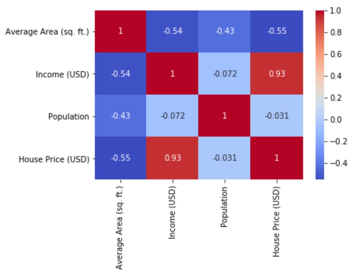
As you can see, the seaborn heatmap shows the correlation coefficients between the variables in the housing dataset, with a coolwarm color map and annotations. We can observe some interesting patterns from the heatmap, such as:
- The price of the house is positively correlated with the average area, income, and number of rooms, and negatively correlated with the address.
- The average area and the number of rooms are positively correlated, which makes sense as larger houses tend to have more rooms.
- The income and the population are negatively correlated, which could indicate that higher-income areas have lower population density.
Flight Dataset
The flight dataset contains information about the number of passengers on flights between New York and some other cities for each month and year from 1949 to 1960. We can load the dataset from seaborn using the load_dataset() function:
# Load the flights dataset flights = sns.load_dataset('flights') |
We can then pivot the dataset to create a tabular format, where each row represents a month, each column represents a year, and each cell represents the number of passengers:
# Pivot the dataset flights = flights.pivot('month', 'year', 'passengers') |
We can then create a seaborn heatmap from the pivoted dataset using the heatmap() function:
# Create a seaborn heatmap sns.heatmap(flights, cmap='YlGnBu', linewidths=.5) # Display the seaborn heatmap plt.show() |
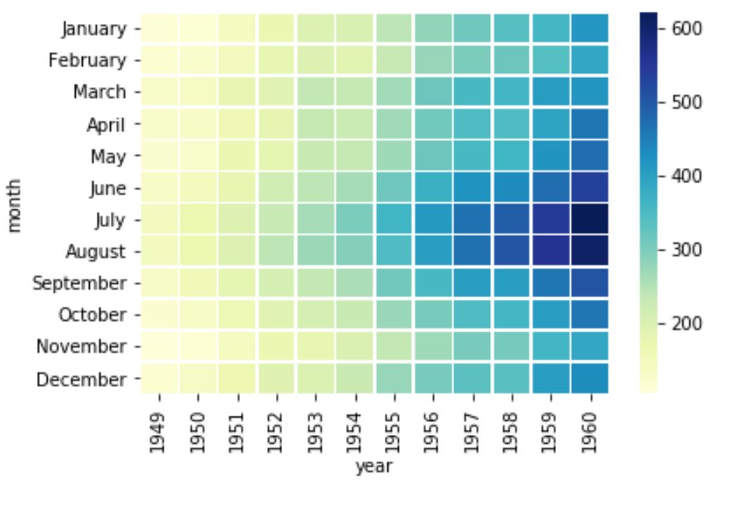
As you can see, the seaborn heatmap shows the number of passengers for each month and year, with a YlGnBu color map and thin white lines separating the cells. We can observe some interesting patterns from the heatmap, such as:
- The number of passengers increases over time, indicating a growing demand for air travel.
- The number of passengers varies seasonally, with peaks in the summer months and dips in the winter months.
- The year 1958 has the highest number of passengers, followed by 1960 and 1959.
Titanic Dataset
The Titanic dataset contains information about the passengers on the Titanic, such as their age, sex, class, fare, survival, and more. We can load the dataset from seaborn using the load_dataset() function:
# Load the titanic dataset titanic = sns.load_dataset('titanic') |
We can then create a correlation matrix from the titanic dataset using the corr() method:
# Create a correlation matrix corr = titanic.corr() |
We can then create a seaborn heatmap from the correlation matrix using the heatmap() function:
# Create a seaborn heatmap sns.heatmap(corr, cmap='coolwarm', annot=True) # Display the seaborn heatmap plt.show() |
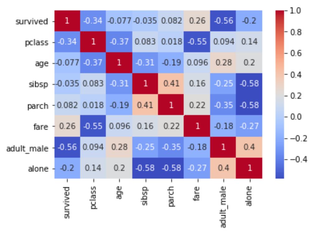
As you can see, the seaborn heatmap shows the correlation coefficients between the variables in the titanic dataset, with a coolwarm color map and annotations. We can observe some interesting patterns from the heatmap, such as:
- The survival of the passengers is positively correlated with their class and fare, and negatively correlated with their sex and age, indicating that higher-class, wealthier, female, and younger passengers had a higher chance of survival.
- The class of the passengers is negatively correlated with their sex and age, indicating that lower-class passengers were more likely to be male and older.
- The fare of the passengers is positively correlated with their class and the number of siblings and spouses they had on board, indicating that higher-class and larger-family passengers paid more for their tickets.
How to Use Seaborn Heatmap Parameters
Seaborn heatmap offers a lot of parameters that you can use to customize the appearance and behavior of the heatmap. Some of the most common and useful parameters are:
- data: The data to plot, must be a two-dimensional array or a DataFrame.
- cmap: The color map to use for the heatmap, can be a string or a colormap object.
- cbar: Whether to draw a color bar or not, can be a boolean or a color bar object.
- cbar_kws: A dictionary of keyword arguments to pass to the color bar creation.
- annot: Whether to annotate each cell with the data value or not, can be a boolean or a two-dimensional array of strings.
- annot_kws: A dictionary of keyword arguments to pass to the annotation creation.
- fmt: The format string to use for the annotations, can be a string or a function.
- linewidths: The width of the lines that separate the cells, can be a number or an array.
- linecolor: The color of the lines that separate the cells, can be a string or a color object.
- center: The value at which to center the color map, can be a number or None.
- vmin: The minimum value to use for the color map, can be a number or None.
- vmax: The maximum value to use for the color map, can be a number or None.
- square: Whether to make the cells square or not, can be a boolean.
- xticklabels: Whether to show the x-axis tick labels or not, can be a boolean, a list, or an integer.
- yticklabels: Whether to show the y-axis tick labels or not, can be a boolean, a list, or an integer.
- mask: A boolean array or a DataFrame to mask out some cells, can be an array or a DataFrame.
You can find more details and examples of how to use these parameters in the Seaborn heatmap documentation.
Conclusion about seaborn heatmaps
In this article, we have learned how to create and customize seaborn heatmaps using different datasets and parameters. We have seen how seaborn heatmaps can help us visualize and explore complex data in an intuitive and attractive way. We have also seen how to use correlation matrices to create tabular formats from real-world data, and how to interpret the patterns and relationships from the heatmaps.
Seaborn heatmaps are a powerful and versatile tool for data visualization, and we hope that this article has inspired you to use them in your own projects. If you have any questions or feedback, feel free to leave a comment below. Happy plotting! 😊